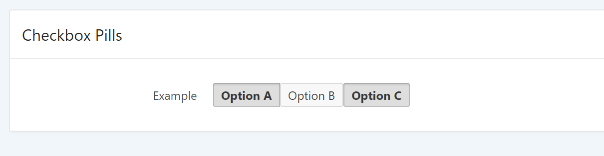
Checkbox Pills

Demo: https://apex.oracle.com/pls/apex/f?p=128166:1
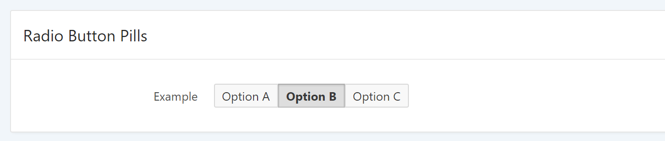
Universal Theme offers a template option for radio button items to make them look like buttons:
As of this writing (APEX 5.1.1), this template option does not work on checkboxes. But wouldn't it be nice to have something like this?
-
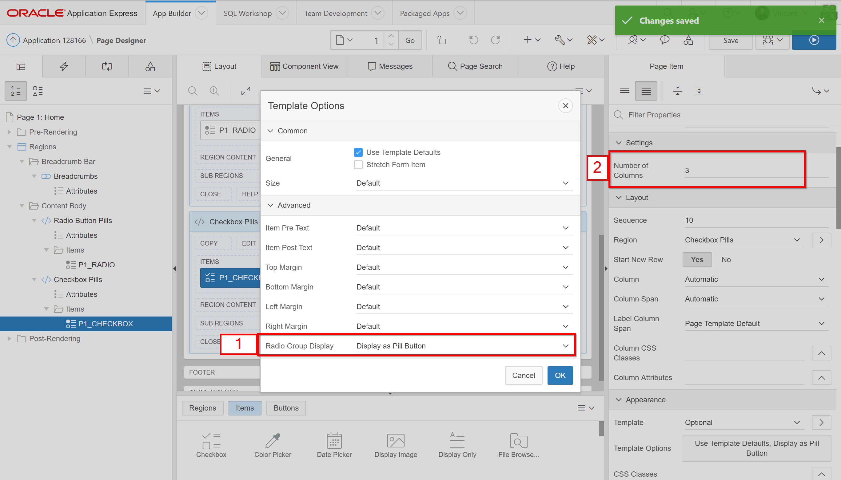
Apply these settings to your checkbox item:
- Apply template option Display as Pill Button
- Set the number of columns to be equals or greater than your number of checkboxes
-
Add this CSS to your page:
.t-Form-fieldContainer--radioButtonGroup .apex-item-checkbox table.checkbox_group tr td {
	padding: 0;
}

.t-Form-fieldContainer--radioButtonGroup .apex-item-checkbox table.checkbox_group input+label:after, .t-Form-fieldContainer--radioButtonGroup .apex-item-checkbox table.checkbox_group input+label:before {
	display: none;
}

.t-Form-fieldContainer--radioButtonGroup .apex-item-checkbox label {
	min-width: 48px;
}

.t-Form-fieldContainer--radioButtonGroup .apex-item-checkbox input+label {
	color: #383838;
	background-color: #f8f8f8;
	box-shadow: 0 0 0 1px rgba(0, 0, 0, .125) inset;
}

.t-Form-fieldContainer--radioButtonGroup .apex-item-checkbox input:checked+label {
	background-color: #dedede;
	color: #383838;
	box-shadow: 0 0 0 1px rgba(0, 0, 0, .15) inset, 0 2px 2px rgba(0, 0, 0, .1) inset;
}

.t-Form-fieldContainer--radioButtonGroup .apex-item-checkbox table.checkbox_group input+label {
	padding: 4px 8px;
	width: 100%;
	text-align: center;
}

.t-Form-fieldContainer--radioButtonGroup .apex-item-checkbox table.checkbox_group td label {
	border-radius: 2px;
	margin: 0;
	display: block;
}

.t-Form-fieldContainer--radioButtonGroup .apex-item-checkbox table.checkbox_group td:first-child label {
	border-top-right-radius: 0;
	border-bottom-right-radius: 0;
}
Note: this will work best when using the Vita theme style. Feel free to change to color values according to your theme style.
Enjoy these APEX CSS tricks? Let me know and I'll post more.